
Product: An end-to-end iOS app for generating recipes
Role: UX and UI Designer
Timeline: February 2021 - May 2021
Tools: Figma, Procreate, Maze.co, Invision
Note: This is a project completed for DesignLab’s UX Academy
THE PROBLEM
Have you stared into your fridge to figure out what you can cook with the ingredients you have in there?
Well, I run into this problem all the time and it’s mentally draining! So I wondered—why not have an app that recommends recipes to the user?
RESEARCH
Starting off with several research goals
In addition to this being a recipe app, I wanted to know if users were interested in making a positive environmental and social impact so I established four research goals:
Save time and money
Maximize existing ingredients
Reduce landfill and carbon footprint
Support diverse and local businesses
The pandemic encouraged people to explore home cooking
More than half of U.S. consumers have been eating at home more often since the coronavirus outbreak.
People have a hard time planning different meals every day as one of the biggest challenges eating during pandemic
More people found a new passion for cooking
Grocery stores are designed as a “treasure hunt” for experience-seeking shoppers by introducing more ethnic or newness-kind-of food items
Collecting insights from people who cook
Objectives for the interviews:
If the interviewees resonated with my four goals
Figure out their current eating/cooking habit during the pandemic
Target audience:
I interviewed two male and four female interviewees who cook during the pandemic.
Interviewees prioritize maximizing ingredients they have at home when cooking
Based on the six interviews, the interviewees resonated with only one of my research goals: maximize existing ingredients. They would like to be more environmentally friendly and support local businesses, but their main goal when buying groceries is to use everything they buy. They are afraid of exposing themselves and their loved ones to COVID-19 (during this time we didn’t have the vaccine available).
Interviews confirmed people enjoy the full cooking experience
I used an affinity map to find patterns from my notes and grouped them based on similarities. Some important takeaways from the interviews discovered from the affinity map:
When they don’t have prepped meals, the interviewees do try to figure out what they can cook with the ingredients they have at home.
They love to partake in the full cooking experience (finding a recipe, buying the ingredients, cooking, and eating), which confirms my secondary research.
They save a copy of recipes in their photo album whether they take an actual picture or a screenshot.
How might we?
Based on my findings so far,
how might we generate recipes based on ingredients the user has at home?
how might we find a way to generate recipes from what the user sees and from saved images?
DEFINE & SYNTHESIZE
Based on my findings, I crafted this persona, Rosie Ayala. Rosie embodies the common goals, needs, and pain points that interviewees had with their cooking journey during the pandemic.
Rosie is mentally and physically drained from cooking impromptu meals
To get a better understanding of the current experience of someone like Rosie figures out what new recipe to cook, I created a user journey map to document the steps, thoughts, and emotions she may experience.
Overall, these are the biggest issues identified from the journey map:
Research phase: there is a lot of information overload and Rosie’s drained from web surfing
Cook phase: she still needs to check if she has all the ingredients on hand
Gauging what other platforms are doing
Since this is the first round in its design, I wanted to get a better understanding of where my product stands in the market and gauge the usability of the user interface of its direct and indirect competitors. I added Google Lens into this comparative analysis for its image recognition feature. Based on the interviews, it was very common for interviewees to save pictures in their phone of food or recipes they’ve seen (on the Internet or in-person). I thought it would be a useful feature users can use to generate recipes.
Establishing the user flow of the recipe app
Since I am working on a shorter deadline, I decided to focus this round on “How might we generate recipes based on what the user has at home?”
With the insights gathered from the user journey map and competitive analysis, I mapped a user flow to illustrate the screens Rosie would encounter as she looks for a recipe on the app. More importantly, the ways to resolve the biggest issues she faced when she was looking for a recipe.
To alleviate the information overload experienced from the research phase, the user will:
create a preference diet profile in the beginning of the app (that wouldn’t need to be updated unless they go to account settings)
narrow the recipes by using the filtering option after the initial search
And, to ensure all the ingredients are readily available to be used, the user can take a picture of all the ingredients they want to use in the desired meal.

DEVELOP & IDEATE
Sketching designs to address pain points discovered in the user journey
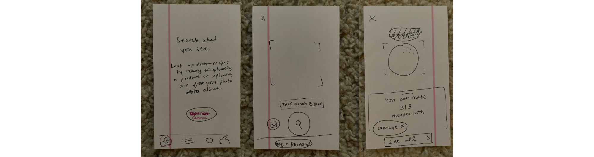
Based on the user flow, I drafted several screens and selected the sketches the user would see as they find a recipe and most importantly the screens to solve the biggest problems discovered during the user journey map:
Research phase: there is a lot of information overload and Rosie’s drained from web surfing
Cook phase: she still needs to check if she has all the ingredients on hand

Preference diet profile to reduce information fatigue. Since the user has a preferred diet, this filtering would remain more consistent as they search for recipes.
Filtering system to narrow down recipes based on other flexible criteria

A camera feature with image recognition to quickly capture ingredients on hand and generate recipes live-time.
Designing a delightful and fun visual cooking experience
Going with the idea of “maximizing time”, I thought of the Pomodoro Technique. It’s a timer to break work into intervals, traditionally 25 minutes in length, separated by short breaks. I thought “Whip Up” as the app’s name would be fitting as the user is cooking something quick. The Pomodoro Technique uses tomato as a visual reference so I used red and green from the tomato as the recipe app’s main colors. I wanted to use Procreate to hand draw fun, light-hearted images and GIFs.
Voila! The prototype of Whip Up :)
You can watch a demo of the app from the video below or you can interact with the prototype on Figma.
DELIVER & IMPLEMENTATION
Setting up the test for users
Objectives:
Determine the overall ease of use and flow of the app, as well as areas of confusion, or frustration for users
Determine whether the camera feature is a viable way to search for recipes
Determine how users interpret the information on the screens (which ways do they use, ignore, or don’t see)
Subject: A high fidelity mobile prototype was used via Figma
Methodology: An unmoderated test was run through Maze.co
Recruitment: Posting a link of the Maze test on Slack and Facebook
Tasks:
Create an account by entering an email address and a password.
Create a dietary preference profile for your family of three. Your family must eat halal and your partner is allergic to gluten.
Take a picture of an onion, tomato, spaghetti, and chicken breast.
You are in the mood for baked chicken pasta. Find an Italian dinner recipe that you can make in 30 minutes or less.
Results from the usability test
Based on the results from the Maze testing, Task 1, 2, and 3 were successful with scores above 84%. However Task 4 scored a success rate of 41.7%.
Participants: 90 testers
Overall task completion rate: 93.4%
Give-up/Bounce rate: 6.7%
Tasks:
Create an account by entering an email address and a password.
Success rate: 84.9%
Create a dietary preference profile for your family of three. Your family must eat halal and your partner is allergic to gluten.
Success rate: 94.6%
Take a picture of an onion, tomato, spaghetti, and chicken breast.
Success rate: 95.2%
You are in the mood for baked chicken pasta. Find an Italian dinner recipe that you can make in 30 minutes or less.
Success rate: 41.7%
Based on the usability breakdown from the Maze report, the average misclick for Task 4 was 35%. Task 4 had a low score as the buttons did not have a clear call-to-action and the task required too many steps within the filter, resulting in the highest misclicks from the entire test.

Post-test commentaries confirm Task 4 was the most confusing
15/49 of testers thought the tasks were straightforward
34/49 of testers were confused and frustrated in some/all of the tasks
The filter for Task 4 was the most confusing to complete
IDEATE (AGAIN)
Revising critical screens to reduce misclicks
I reviewed the screens and data tied to Task 4 to figure out what I should do to improve the user experience. For the first screen, the call-to-action (CTA) button is located at the bottom of the modal. The testers couldn’t figure out what to click in order to move to the next screen so they clicked everywhere until they reached the end of the modal. To reduce the number of misclicks, I raised the modal higher on the screen to reveal the CTA button. I converted the tags into a horizontal scroll to create more real estate for the CTA button to appear.

I added the horizontal scroll for tags on this screen to keep the features consistent across the app. Based on feedback from the testers, the filter label is “too small” and “a bit little for me and was hard to find and click on it”. I created a CTA button for the filter so it’s clear you can click on it.

Figma prototype capability is limited so the task must be simple
Although the filter had the highest misclick (80%), the visual design was not the issue. Instead, my task had too many steps for the tester to complete on the Figma prototype. When you’re setting the hotspots for the Figma prototype, the tester must click on the exact order. If not, the tester cannot move forward with the task. My task required the tester to click three tags in the filter: “Under 30 minutes”, “Dinner” and “Italian” in order to proceed. Since the testers were not aware of this, they naturally clicked everywhere until they can be taken somewhere else.
For the next round of usability testing, I will have the tester select one tag from the filter. This information is enough for me to determine the user understands where the filter button is located and they know how to click the tag to narrow the recipes.

REFLECTION
Takeaways from this case study
Journey maps are AWESOME when creating an end-to-end product as the process is extremely open-ended. They identify the user’s problem during a process so user flow can be created and ideation can actually address identified problems.
Make sure to test your tasks with a small controlled sample since unmoderated users are testing a prototype with a limited flow. It could be the task is too complicated compared to the design.
Don’t marry your ideas. Test and embrace users’ feedback every step of the process.
Down the future with the app
Address the second HMW to find a way to generate recipes from what the user sees from saved images.
Although all original goals weren’t incorporated, such as sustainability, I would like to still find ways to promote them in future iterations of the app.